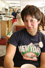
 I love small pictures-- really small pictures. Every little bit is so intentional and important. Here at CCA, I've noticed that whenever a photographer is getting critiqued, our peers and teacher are always pushing them to 'go bigger.' I guess I understand this, and in most cases would agree-- but I think that often people employ larger size to compensate for poor composition. The printmaking professor at Wesleyan, David Schorr, once told our class that the easiest way to check one's composition is to hold it in front of a mirror-- if it looks good both ways, then it's good. This theory obviously has more heft in a medium like printmaking where the production process is founded on reversal-- but I think the point of Schorr's adage is that a good composition can look good no matter the direction, size, color, etc. If it's a good picture, it'll look good when it's small too-- after all, the source of photography is traditionally small (the negative) and anyone who has taken darkroom photography knows the skill of looking through rolls and rolls of small rectangles for a gem of a photograph.
 My 11th grade English teacher, the fabulous Rebecca Gergely, once had us write short stories that were under 500 words long. Then we edited them to under 200 words. Then 100. The point of the exercise was teaching us how to be intentional, to show the weight of words, the importance of choice, the skill of being allusive. What's the expression? A picture is worth a thousand words? Could I push a new slogan, that a dozen good words can be worth a thousand words? Hmmm.... not as catchy, but maybe you get the idea.
For these small pictures of people, because I can't really tell what their faces look like, I find myself paying more attention to the posture and body language of the figures. In the teeny tiny landscapes I stop searching for the specificity of where that place is and start noticing the formal shapes and emotional undertones. Their smallness invokes a sensitivity in me that I'm less likely to employ when looking at something that is large. Kerst and Deanna told me that at SF MOMA there is a project from the 70's/80's where an artist asked for photographs from peoples wallets, blew them up and printed them huge for the museum context. I'd like to see these and think about how the size aggrandizes or dimishes them, or if it just changes them into something else completely.

No comments:
Post a Comment